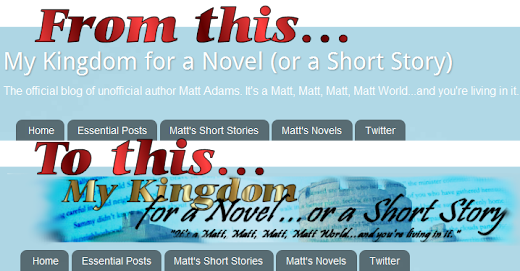
I did make a slight tweak to the blog this weekend, designing a header to replace the generic white text at the top of the blog. I'm pleased with the result and decided to make a quick comparison.
The top graphic is how the blog has looked for the last few weeks; the bottom graphic shows the new blog header, which went into play Saturday.
You can click the image to enlarge.

